These are my old webdesigner PTSDs surfacing but... I never realized that before, because well... I understood the UI pretty much immediately.
I've stumbled on a few newcomers that did not find the download button in the resources.
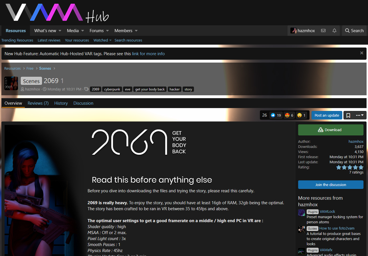
Maybe you could streamline a bit "interactions" on the resource page to avoid the user searching in different places to click. And also boost a bit the size of the download button like in the screenshot below.
Of course the "go to pay site" or stuff like that would also be here.
With that, all the interactions are located around the top right of the right column... there's way less chance that someone is gonna miss it.


