Featured Contributor?

RandomVAMUser

Well-known member
Messages
763
Reactions
750
Points
93
I don't know if this feature is now automated or still manual nitpick.
But color choice feels bit distracting when reading forum (compared to rest of the site elements).
It's too "sharp" (out of place) type of blue...
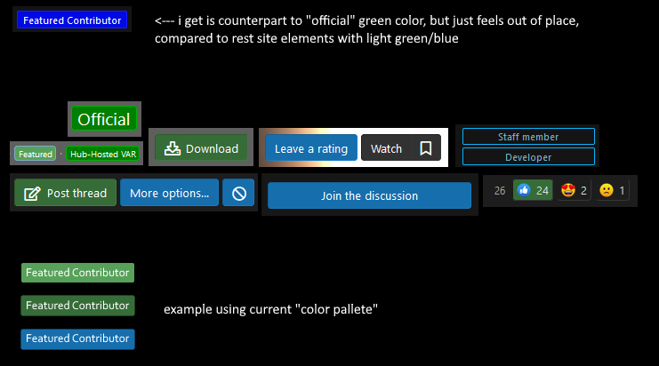
featured.jpg

...or maybe it's just me with terrible eyesight.
 
I don't know if this feature is now automated or still manual nitpick.
But color choice feels bit distracting when reading forum (compared to rest of the site elements).
It's too "sharp" (out of place) type of blue...
View attachment 94652
...or maybe it's just me with terrible eyesight.


I think it is meant to be this way, if you notice, the normal green is a duller green, while the badge green is a high saturated green. The same for the blues, but blue is more noticeable to the eye
 
I think it is meant to be this way, if you notice, the normal green is a duller green, while the badge green is a high saturated green. The same for the blues, but blue is more noticeable to the eye
I totally get what you are saying and i can see it as "counterpart" to official/hub-hosted (badge) shade of green.
But take staff member or developer for example, it's more dull (in tone with rest of the site).

I find it bit distracting while reading, my eyes gaze left like there's some ad or smth (thank god we have signatures disabled).

I don't know, maybe because it's something new and we just need to adapt.
That was my first impression (feedback).
 
Back
Top Bottom