Version 5
Early version: APIs and looks may change; use at your own discretion.
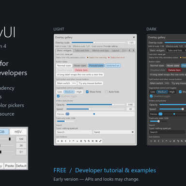
New optional Overlay Panel UI component: the texture picker (OverlayPanelTexturePicker, optional file). One collapsed row per texture (large thumbnail or checkerboard, title, file name), and a popup like the color picker's for your buttons and tiling/offset sliders. Two heights: the default (two lines of text) matches a native dropdown, compact: true is one line (title, then file name) as tall as input fields and buttons. The popup is as wide as its row; when the row spans the full panel width, the tiling and offset sliders sit two per line (X and Y side by side), and on a half-width row they stack. It never reads files or owns textures; your plugin does. List the file in your .cslist only if you use it.
In Overlay Panel UI, the library's own backgrounds (status table, tabs frame, dialogs, color picker, the theme switch at the top of a page) now use the native controls' corner radius, 4 (it was 8), so they match the dropdowns, sliders and buttons beside them.
Texture pickers and color pickers can share a page; only one of either is open at a time.
The tutorial (English) and the Chinese README now describe the texture picker.
No change to global parameter names or marker type names. To move a consumer from 4 to 5, change its .cslist references and its dependency to version 5.
Version 4 is the public version before this one: its settings-panel part was rewritten from a written functional specification, and the earlier version 3 was withdrawn from the Hub over licensing.