

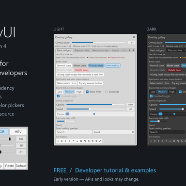


This is an early version; APIs and looks may change in later versions — use at your own discretion.
OverlayUI — a free developer tutorial and source widget library
Build screen overlays (Overlay) and in-panel plugin interfaces (Overlay Panel UI, inside VaM's plugin settings panel) with light/dark palettes, layout, menus, sliders and color pickers. Install one source dependency; consumer packages do not carry duplicate library files. Includes OverlayGallery, a runnable example with source. No CustomUI DLL is required.


Install and explore
Use it in your own plugin
The full English tutorial, complete compilable quick start and component usage are inside the var:
One line alone is not enough. Use the complete list; do not use .latest in .cslist. Declare the same version in your meta.json:
Use namespace
Components in the example
Basics (light and dark), tabs and lists, menus and tips:

Layout, palette, panels and parameters:

Tiles and board:

Overlay Panel UI
Two parts, use them together. OverlayUI has two parts for two different purposes, and they are not alternatives: one plugin can (and OverlayGallery does) use both.

How to wire it in
Overlay Panel UI, part by part (OverlayGallery's "Overlay Panel UI" section; the gallery has no example of MiniSlider, string fields, grid rows or panel dialogs)

Native controls, layout, axis ball and color picker:

Theme, scale and coexistence
Any plugin may act as a provider; none is required.
Library types are
Skynet Tooltips inspired hover-tip interaction. Source and example: mutoe, CC BY 4.0; see packaged CREDITS.md for attribution.
Third-party icon in the example:
The code was written mainly by AI coding assistants under the author's direction. Screenshots show the actual plugin UI. Desktop VaM is the test target; VR controller behavior is not verified.
Versions 1 and 2 were local only. Version 3 was withdrawn from the Hub over licensing; version 4 rewrites the affected panel parts and is resubmitted under CC BY.
OverlayUI — a free developer tutorial and source widget library
Build screen overlays (Overlay) and in-panel plugin interfaces (Overlay Panel UI, inside VaM's plugin settings panel) with light/dark palettes, layout, menus, sliders and color pickers. Install one source dependency; consumer packages do not carry duplicate library files. Includes OverlayGallery, a runnable example with source. No CustomUI DLL is required.
Install and explore
- Install
mutoe.OverlayUI.4.varin VaM's AddonPackages and rescan/restart. - Add a Session or Scene plugin from
mutoe.OverlayUI.4:/Custom/Scripts/mutoe/OverlayUI/Example/OverlayGallery.cslist. Allow its scripts when prompted. - Explore its nine tabs and plugin settings panel. Theme offers Follow VaM, Light theme and Dark theme. With no global provider, the top scale slider changes only this example.
Use it in your own plugin
The full English tutorial, complete compilable quick start and component usage are inside the var:
Custom/Scripts/mutoe/OverlayUI/README.md. Open/extract the var as a zip to read it. Copy all lines of the adjacent Library.cslist.txt into your plugin's .cslist, followed by your own source paths. A reference looks like:
Code:
mutoe.OverlayUI.4:/Custom/Scripts/mutoe/OverlayUI/OverlayKit.cs
Code:
"dependencies": {
  "mutoe.OverlayUI.4": { "licenseType": "CC BY", "dependencies": {} }
}OverlayUI. Own an OverlayKit, call Update every frame and Dispose(true) on destruction. In a MVRScript, wire layerAdded/layerRemoved to SuperController.AddCanvas/RemoveCanvas. Overlay Panel UI (entry class OverlayPanelMode) is the second part and can be used in the same plugin: create it with new OverlayPanelMode(this) and call Tick/Dispose. Storables, scene changes, image ownership and persistence belong to your plugin.Components in the example
- Basics: button states, split/icon buttons, segments, checks, labeled sliders, editable numbers and search.
- Tabs and lists: nested tabs, grouped dropdowns, scrolling and selection.
- Menus and tips: submenus, checkable/destructive entries, custom colors/icons and hover tips.
- Layout: wrapping flex rows/columns, weighted grids, spans and docking.
- Palette: semantic colors in both themes.
- Panels: title bars, transparency, resizing, wheel choices, compact HSV picker and modal dialogs.
- Parameters: editable values/ranges, defaults, wheel adjustment and appearance state.
- Tiles / Board: reorderable tiles, indicator lights, icons, quick-launch rows and folding.
- Overlay Panel UI example: status tables, two-column tabs, native controls, tips, layout and axis controls. The library also includes a wheel/triangle or square color picker with RGB/HSV/hex/alpha, copy/paste and defaults.
Basics (light and dark), tabs and lists, menus and tips:
Layout, palette, panels and parameters:
Tiles and board:
Overlay Panel UI
Two parts, use them together. OverlayUI has two parts for two different purposes, and they are not alternatives: one plugin can (and OverlayGallery does) use both.
- Overlay (
OverlayKit): floating windows, menus, tiles and tips drawn on a screen-space overlay canvas over the scene. It follows the global overlay scale (VaM's monitorUIScale times_OverlayUI_Scale). Use it for what should float over the scene. - Overlay Panel UI (
OverlayPanelModeis its entry class): library widgets drawn inside VaM's own plugin settings panel, in its left and right columns, mixed with the native toggles, sliders and dropdowns. It follows VaM's native look and the panel's own scaling and is not drawn on screen. Use it for what belongs in the plugin's settings panel (status readouts, tabbed options, axis input).
How to wire it in
- Create
new OverlayPanelMode(this)in your MVRScript'sInit. The constructor also starts the built-in hover tips for your plugin (PanelTips.Init). - Call
panel.Tick()every frame andpanel.Dispose()inOnDestroy. CallPanelTips.Resume(this)/Suspend(this)fromOnEnable/OnDisable. - Library widgets go into blocks:
panel.FullWidth(gapAbove, gapBelow)for a block across both columns,panel.Block(right, false)for one column. Usepanel.Level(gap)to even out the two columns before the next row of native controls. - Native controls come from the host as usual:
host.CreateToggle / CreateSlider / CreatePopup / CreateButton. Register theirJSONStorablevalues in your plugin. - Theme:
_OverlayUI_PanelTheme(see below) is an optional flag a provider sets when it can theme the native controls too. Without a provider the panel simply follows VaM; show a theme switch only whenpanel.ThemeSwitchAvailableis true. Native controls must stay outside the library's marked subtrees.
Code:
using OverlayUI;

public class MyPlugin : MVRScript
{
    private OverlayPanelMode panel;
    private OverlayStatTable table;
    private OverlayStatRow rowFps;

    public override void Init()
    {
        panel = new OverlayPanelMode(this);
        OverlayPanelBlock block = panel.FullWidth(26f, 14f);
        table = new OverlayStatTable(panel, block.root, true);
        table.Group("Live values", false);
        rowFps = table.Row("Frame rate", "Hover tip for this row.");

        JSONStorableBool on = new JSONStorableBool("My toggle", true);
        RegisterBool(on);
        PanelTips.Add(CreateToggle(on, false), "A native toggle with a built-in tip.");
        panel.Level(18f);
    }

    public void Update()
    {
        if (panel == null) return;
        panel.Tick();
        table.Set(rowFps, "62", false, OverlayStatTable.Ok);
    }

    public void OnEnable() { PanelTips.Resume(this); }
    public void OnDisable() { PanelTips.Suspend(this); }
    public void OnDestroy() { if (panel != null) panel.Dispose(); }
}
Overlay Panel UI, part by part (OverlayGallery's "Overlay Panel UI" section; the gallery has no example of MiniSlider, string fields, grid rows or panel dialogs)
- Status table (
OverlayStatTable): aligned label/value rows for readouts.Groupadds folding headings,Rowcreates a row (with an optional hover note) andSet(row, value, translate, state)updates it; only changed rows are written. The pictures show the warning state (amber dot and value), in light and in dark. - Tabs (
OverlayPanelTabs): a classic tab strip: the tabs join into one row with small rounded top corners, and the selected tab is connected to the framed content box under it. Register pages withTab, put native controls into them withAddand switch withSelect; build once and change visibility. The style is the fourth constructor argument,new OverlayPanelTabs(panel, 0f, 0f, OverlayTabStyle.Classic)(the picture); the other styles areOverlayTabStyle.Button(a row of native-looking buttons, the default),UnderlineandVertical(a column of tabs beside the content box). The picture shows the second tab selected. - Hover tips (
PanelTips):PanelTips.Add(control, text)attaches a tip to a native control, or to any library widget's transform. The tip follows the theme and stays out of the way while a slider is dragged. The picture shows a tip beside a native toggle. - Native controls (
host.CreateToggle/Slider/Popup/Button): VaM's own controls keep their saving and scripting behavior and mix freely with library blocks. The picture shows a toggle and a popup in the left column, and a slider (with its quick-step buttons) and a button in the right column. - Layout (
panel.Block,panel.Level,panel.Stack): single-column blocks that grow with their content, evened out against the other column, and a wrapping flex row. The picture shows a small table in the left column beside a wrapping row of chips in the right column. - Axis ball (
OverlayAxisBall): drag the rings to rotate, arrows and squares to move, the small axis squares to scale one axis and the center dot to scale all three. It only reports deltas through callbacks (moved,rotated,scaled); your plugin applies them. The picture shows the ball beside a table of the values it edits. - Color picker (
panel.ColorPicker(block.root, color, alpha, label), classOverlayPanelColorPicker): a wheel with a triangle or an SV square, RGB/HSV channels, an editable hex value, copy/paste and a default button. Register aJSONStorableColor(and optionally aJSONStorableFloatfor opacity; passnullfor none) in your plugin first. The picture shows the expanded picker.
Native controls, layout, axis ball and color picker:
Theme, scale and coexistence
_OverlayUI_Dark requests dark at 1 (otherwise light); _OverlayUI_Scale publishes a positive global overlay factor (0 = absent); _OverlayUI_ScaleRequest is a request mailbox a provider can consume and clear. Effective overlay size is VaM's monitorUIScale times the global factor, clamped to 0.5–3. Without a provider, light is the default and the plugin's own fallback scale is used. Theme/scale updates recolor/rescale without rebuilding controls during a drag.Any plugin may act as a provider; none is required.
_OverlayUI_PanelTheme is an additional optional capability flag for providers that can theme native settings controls; only offer that override when ThemeSwitchAvailable is true. Overlay Panel UI uses VaM's own panel scaling.Library types are
internal: each consumer compiles its own assembly copy. Different plugins/versions can coexist while sharing installed source files. Keep exact referenced versions installed. Global names/semantics, marker names (OverlayRoot, OverlayPanelRoot, OverlayPanelThemeMark, OverlayNativeLook) and documented source APIs are compatibility contracts. Every published content change gets a new integer version; published same-version packages are never overwritten. Breaking changes require migration notes and must preserve older consumers' global/marker contracts.Skynet Tooltips inspired hover-tip interaction. Source and example: mutoe, CC BY 4.0; see packaged CREDITS.md for attribution.
Third-party icon in the example:
Example/assets/icons/meter-ffffff.png is the IBM Carbon meter icon from the IBM Carbon Design System (carbon-icons), Copyright IBM Corp., licensed under the Apache License 2.0 (rendered as a white 128px PNG with padding). The full license text is in the package at third-party/Carbon-LICENSE.txt. The CC BY license above does not relicense it.The code was written mainly by AI coding assistants under the author's direction. Screenshots show the actual plugin UI. Desktop VaM is the test target; VR controller behavior is not verified.
Versions 1 and 2 were local only. Version 3 was withdrawn from the Hub over licensing; version 4 rewrites the affected panel parts and is resubmitted under CC BY.

