A short guide to help you troubleshoot your Normal Maps. It assumes that you already know what a normal map is and that you have yours in the correct space (tangent vs world space and so on). Feel free to comment when you have correction, additions, questions.
Basics
Normal maps in Virt-A-Mate go into the _BUMP slot when importing textures (despite the naming "bump maps" or "height maps" won't work).
There are a few ways to encode normal maps. I exported mine from Blender and made some in Photoshop. They looked okay, but at a closer examination there was something not quite right with both versions. So here is how exactly a normal map in VAM is supposed to look like. And how to convert one in Photoshop to the correct format.
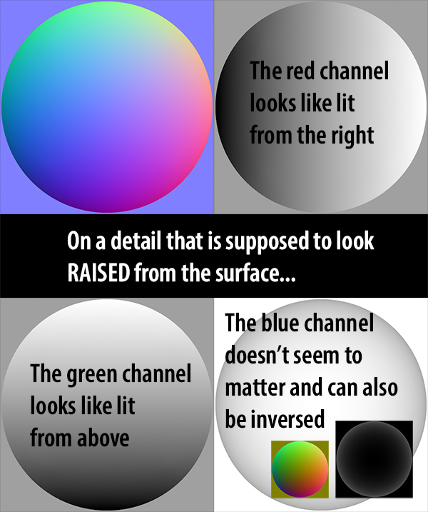
The normal maps I got from Blender had a strange yellow look. This is mainly caused by an inverted blue channel. However in my test the blue channel had no effect. So if you have a yellow normal map it can still be correct.
What matters are the green and red channels. Both Photoshop and Blender where giving me files where one of them was inverted. Here is a step by step guide through Photoshop on how to make and CORRECT those channels.
Making a Normal Map in Photoshop
To make a simple Normal Map with Photoshop you need a greyscale image. I won't go into detail, but in short: It relies on contrast between neighboring colors and everything that goes darker will look impressed, while everything where the contrast goes to lighter will look raised.
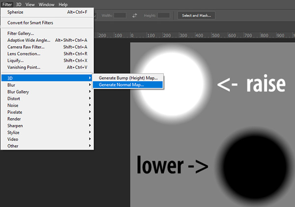
Find the Normal Map Generator under Filters -> 3D -> Generate Normal Map. It will open a 3D Preview and you can make a bunch of adjustments. However leave the checkbox "Invert Height" empty:
Correcting a Normal Map in Photoshop
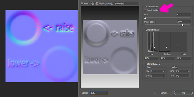
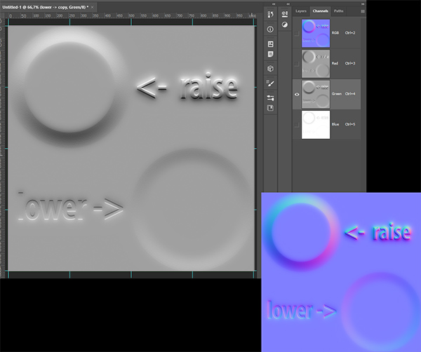
From the Preview Image you can already guess that the Green Channel is weird. It looks brighter at the bottom of the raised circle... Just from looking at the image we perceive it as "impressed" rather then "raised". Now look at the Channels. You can find them Under Window -> Channels. There are usually tabbed next to the Layers window.
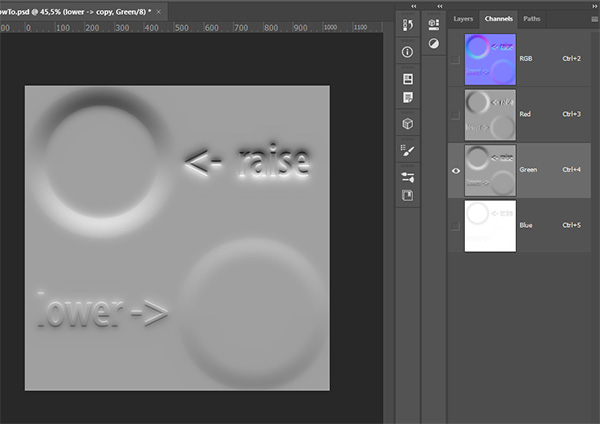
The red Channel looks like it's lit from the right. Fine.
But the Green Channel has the light on the "down facing" parts. Luckily it's super easy to fix: Just select the Green Channel to solo view it. Then Invert it. You can do this by hitting the CTRL+I keys or this menu item:
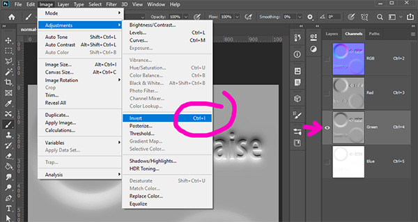
The resulting Green Channel and the overall Normal Map will now look like this. Good Job.
When I exported a bunch of Normal Maps from Blender (with Simple Bake) GREEN was fine, but the RED and the BLUE channel were inverse. While Blue does not matter, the RED channel had to be flipped. It's generally a good idea to quickly check the channels no matter where your maps are from.
In VAM
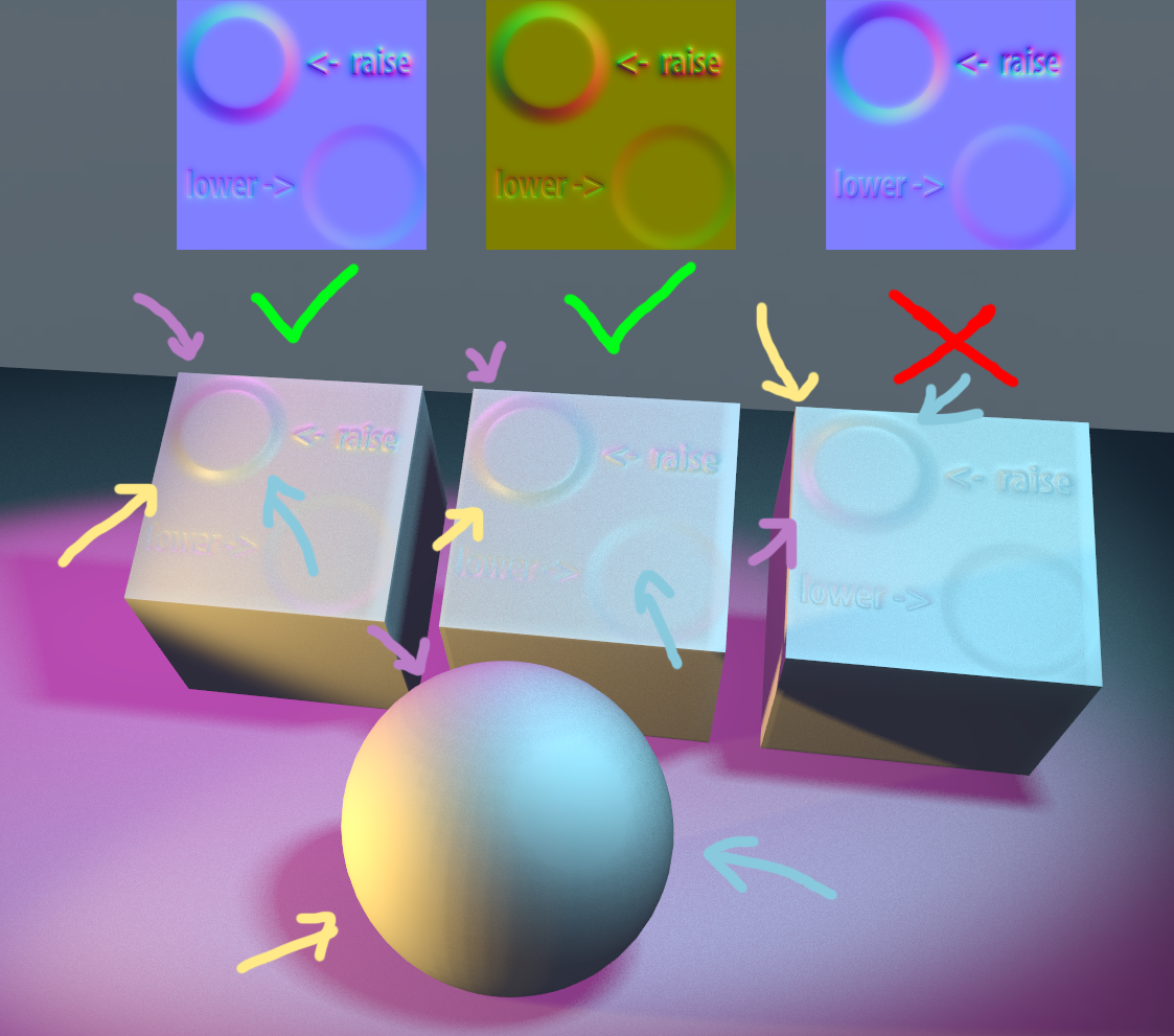
And here are the resulting Maps in VAM for comparison. Left to right: Normal Map with corrected green channel, Normal Map with correct Red and Green channels and flipped Blue channel, Normal Map with wrong Green channel. Note the light directions on the Sphere: The yellow light comes from the lower left, but on the wrong normal map it looks like it's coming from the upper left. This is plain wrong, it could never be in that spot.
Additional Tips&Tricks
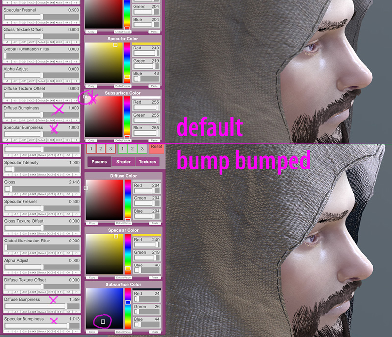
The default settings for example on clothing can look rather flat. Change the material settings to improve the contrast:
Basics
Normal maps in Virt-A-Mate go into the _BUMP slot when importing textures (despite the naming "bump maps" or "height maps" won't work).
There are a few ways to encode normal maps. I exported mine from Blender and made some in Photoshop. They looked okay, but at a closer examination there was something not quite right with both versions. So here is how exactly a normal map in VAM is supposed to look like. And how to convert one in Photoshop to the correct format.
The normal maps I got from Blender had a strange yellow look. This is mainly caused by an inverted blue channel. However in my test the blue channel had no effect. So if you have a yellow normal map it can still be correct.
What matters are the green and red channels. Both Photoshop and Blender where giving me files where one of them was inverted. Here is a step by step guide through Photoshop on how to make and CORRECT those channels.
Making a Normal Map in Photoshop
To make a simple Normal Map with Photoshop you need a greyscale image. I won't go into detail, but in short: It relies on contrast between neighboring colors and everything that goes darker will look impressed, while everything where the contrast goes to lighter will look raised.
Find the Normal Map Generator under Filters -> 3D -> Generate Normal Map. It will open a 3D Preview and you can make a bunch of adjustments. However leave the checkbox "Invert Height" empty:
Correcting a Normal Map in Photoshop
From the Preview Image you can already guess that the Green Channel is weird. It looks brighter at the bottom of the raised circle... Just from looking at the image we perceive it as "impressed" rather then "raised". Now look at the Channels. You can find them Under Window -> Channels. There are usually tabbed next to the Layers window.
The red Channel looks like it's lit from the right. Fine.
But the Green Channel has the light on the "down facing" parts. Luckily it's super easy to fix: Just select the Green Channel to solo view it. Then Invert it. You can do this by hitting the CTRL+I keys or this menu item:
The resulting Green Channel and the overall Normal Map will now look like this. Good Job.
When I exported a bunch of Normal Maps from Blender (with Simple Bake) GREEN was fine, but the RED and the BLUE channel were inverse. While Blue does not matter, the RED channel had to be flipped. It's generally a good idea to quickly check the channels no matter where your maps are from.
In VAM
And here are the resulting Maps in VAM for comparison. Left to right: Normal Map with corrected green channel, Normal Map with correct Red and Green channels and flipped Blue channel, Normal Map with wrong Green channel. Note the light directions on the Sphere: The yellow light comes from the lower left, but on the wrong normal map it looks like it's coming from the upper left. This is plain wrong, it could never be in that spot.
Additional Tips&Tricks
The default settings for example on clothing can look rather flat. Change the material settings to improve the contrast:
- Subsurface Color has a pretty big impact. Change it to a darker gray/black to darken the cavities. Or even a darker color for additional style. The shadow parts of the model will be tinted in the selected color. But it will also change the lit parts -> The will get subtly tinted in the complementary color to the shadow parts.
- Diffuse Bumpiness: Pushes the shadow parts. Can introduce highlights into shadow parts sometimes.
- Specular Bumpiness: Pushes the Highlights.


