

DockedUI is a UI plugin for creating docked (anchored/screen-locked) or free-floating buttons, toggles, and sliders. Supports adding background images individually per button or applying them to all buttons at once. Includes a built-in hotkey system to quickly show/hide the menu, along with advanced auto-hide options based on user actions.
In Desktop Mode, you can dock buttons to the top-right (or anywhere else on your screen) and have them stay locked in place as you move around the scene.
When switching to VR Mode, you can enable VR-specific positioning — allowing you to undock your buttons, move them freely, and have a separate layout customized for VR use.
This flexible system lets you use the same buttons and triggers across both Desktop and VR modes, providing a seamless experience for all users.
Important Note: Image Display Mode on the Background Tab defaults to Stretched for images. If you change to Center or Tiled, this requires a refresh after changing some sliders or fields to adjust for it specifically. For example if you change Spacing, it will then wait a second until after finished and auto refresh it to your Image Display Mode setting. This is not a bug but a feature that auto refreshes the UI for you. This is not something you will notice with general use but just when creating/changing the UI.
.png")
---
 I want to see how it looks, can you show some examples?
You can use DockedUI with Hero Patterns converted to flattened png images.
So you have tiled background images on your buttons like this...

---
You can use it with Gnome Desktop Icons.
So you have Audio/Media Player buttons like this...

---
You can use it with Open Moji Icons.
So you have Emoji buttons like this...

---
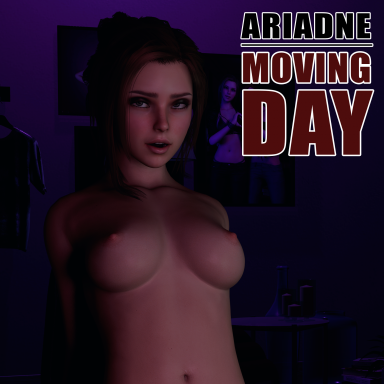
You can use animation preview images on buttons similar to how ascorad did in Ariadne's Moving Day.
 hub.virtamate.com
You could dock them to the top right of the UI in your scene with Desktop Mode.
As you move around in Desktop Mode they will stay in place....

You could undock them and have a separate free floating position for VR Mode...

---
On the Main Tab, you can check VR Mode or uncheck it to switch back to Desktop Mode and your buttons will align to your saved positions for that mode.
If you want to hide the UI in Desktop Mode or VR Mode, you can use the built in Toggle UI Hotkey to toggle them on and off. It defaults to the Escape key but you can change it to another key if you prefer.

---
 Plugin Comparison — DockedUI vs CanvasButton vs VamStory Actions
Shared features Across All Plugins
---
DockedUI Enhancements
---
 I have a scene where I want to use 50–200+ images on buttons but worry about performance issues. Any advice? Also, which is better for performance: UI Image or Image Panel Emissive if I use VAM's built-in options?
What advice would you give to increase performance in an image-heavy UI scene?
 DockedUI already does this automatically.
How would you recommend I set up my scene with DockedUI if I have 50–200+ images?
Here’s an overview of how the tabs work:
Main Tab

---
Actions Tab

---
Text Tab

---
Background Tab

---
Desktop Tab
Used when VR Mode is unchecked on the Main Tab.

---
VR Tab
Used when VR Mode is checked on the Main Tab.

---
A very special thanks to the following who this plugin would not be possible without. Thank you!
Credits
ChenRong.CanvasButton.6 CC BY
14mhz.Plugin-CustomTabUI.3 CC BY
MacGruber.Utils.1 CC BY
All fonts included are redistributed under their original open licenses, which include the SIL Open Font License (OFL), Apache License 2.0, or other licenses explicitly allowing redistribution, modification, and embedding from Google Fonts and Font Squirrel.
In Desktop Mode, you can dock buttons to the top-right (or anywhere else on your screen) and have them stay locked in place as you move around the scene.
When switching to VR Mode, you can enable VR-specific positioning — allowing you to undock your buttons, move them freely, and have a separate layout customized for VR use.
This flexible system lets you use the same buttons and triggers across both Desktop and VR modes, providing a seamless experience for all users.
Important Note: Image Display Mode on the Background Tab defaults to Stretched for images. If you change to Center or Tiled, this requires a refresh after changing some sliders or fields to adjust for it specifically. For example if you change Spacing, it will then wait a second until after finished and auto refresh it to your Image Display Mode setting. This is not a bug but a feature that auto refreshes the UI for you. This is not something you will notice with general use but just when creating/changing the UI.
---
I want to see how it looks, can you show some examples?You can use DockedUI with Hero Patterns converted to flattened png images.
So you have tiled background images on your buttons like this...
---
You can use it with Gnome Desktop Icons.
So you have Audio/Media Player buttons like this...
---
You can use it with Open Moji Icons.
So you have Emoji buttons like this...
---
You can use animation preview images on buttons similar to how ascorad did in Ariadne's Moving Day.
Ariadne - Moving Day - Scenes -
When are the movers supposed to get here? Updated Menu for Version 7: Featuring Ariadne: https://hub.virtamate.com/resources/ariadne.29324/ I designed this as a quick and easy VAMLaunch scene that you can turn on and get...
hub.virtamate.com
You could dock them to the top right of the UI in your scene with Desktop Mode.
As you move around in Desktop Mode they will stay in place....
You could undock them and have a separate free floating position for VR Mode...
---
On the Main Tab, you can check VR Mode or uncheck it to switch back to Desktop Mode and your buttons will align to your saved positions for that mode.
If you want to hide the UI in Desktop Mode or VR Mode, you can use the built in Toggle UI Hotkey to toggle them on and off. It defaults to the Escape key but you can change it to another key if you prefer.
---
Plugin Comparison — DockedUI vs CanvasButton vs VamStory ActionsShared features Across All Plugins
| Features | DockedUI | CanvasButton | VamStory Actions |
|---|---|---|---|
| Supports Both Docked and Floating UI Buttons | Yes | Yes | Floating Only |
| Tab-Based UI | Yes |  No No | Yes, Drop down tabs |
| Create Buttons and Sliders | Yes | Yes | Yes |
| Create Toggle Button | Yes, auto creates/converts button to toggle |  Partial, have to manually convert button to toggle Partial, have to manually convert button to toggle | Yes |
| Create Spacer | Yes | Partial, Global Spacing Slider Only | Yes |
| Global Spacing Slider | Yes | Yes | No |
| VAM Trigger System Integration | Yes | Yes | Yes |
| Scene Save / Load Compatibility | Yes | Yes | Yes |
| Easy Linking to Person / Atom Actions | Yes | Yes | Yes |
| Add, Rename, Copy Buttons | Yes | Yes | Yes |
| Move Buttons/Sort Order Option | Yes | Yes | Yes |
| Remove Selected Button Option | Yes | Yes | Yes |
| Remove All Button Option | Yes | Yes | No |
| Auto Open Trigger Panel on Create Button Option | Yes | Yes | No |
| Dedicated Text Color Setting | Yes | Partial, Shared Color Picker | Yes |
| Dedicated Background Color Setting | Yes | Partial, Shared Color Picker | Yes |
| Text Padding (Top, Bottom, Left, Right) | Yes | No | Yes |
| Text Alignment (Left, Center, Right) | Yes | No | Yes |
| Vertical/Horizontal Button Alignment Toggle | Yes | Yes | No |
| Button Width/Height Adjustment | Yes | Yes | Yes |
| Box Colliders for Better Clickability in VR | Yes | No | Yes |
---
DockedUI Enhancements
| Features | DockedUI | CanvasButton | VamStory Actions |
| Built in Show/Hide Hotkey Mapping | Yes | No | No |
| AutoHide When Unfreeze | Yes | No | No |
| AutoHide When Menu Closed | Yes | No | No |
| Invisible/Reveal | Yes | No | No |
| Inactivity Timer | Yes | No | No |
| Load Preset | Yes | No | Yes |
| Save Preset | Yes | No | Yes |
| Custom VR vs Desktop Mode Settings | Yes | No | No |
| Fonts Offered | 181 Fonts | 1 Default Font | 49 Fonts |
| Bold Text Option | Yes | No | No |
| Italic Text Option | Yes, Synthetic/Software Generated Italic | No | No |
| Dual Font Size controls for Desktop and VR mode | Yes | No, 1 Global Font Size | No, 1 Global Font Size |
| Text Alpha | Yes | No | No |
| Background Image Select (Per Button) | Yes | No | No |
| Background Image Select (Apply to All) | Yes | No | No |
| Image Display Mode Option (Stretched, Tiled, Centered) | Yes | No | Partial, Optimized Default Pattern/Styles |
| Dual UI Scale for Desktop and VR mode | Yes | No | No, 1 Global UI Scale |
| Dedicated Desktop Position Sliders in UI | Yes, with wider Slider Range | Partial, Same Sliders with Toggle | No, move with Global Move Sphere Only |
| Dedicated VR Position Sliders in UI | Yes, with wider Slider Range and Rotation | Partial, Same Sliders with Toggle | No, move with Global Move Sphere Only |
| VR Anchor Mode to World Center Option | Yes, with wider Slider Range and Rotation | Yes, Default but limited range | No, move with Global Move Sphere Only |
| VR Anchor Mode to Head Locked | Yes | No | No |
| VR Anchor Mode Atom Attached / Snap to Atom | Yes | No | No |
---
I have a scene where I want to use 50–200+ images on buttons but worry about performance issues. Any advice? Also, which is better for performance: UI Image or Image Panel Emissive if I use VAM's built-in options?- If you go with UI Image inside the UI layer, it is WAY cheaper than using VAM Image Panel Emissive (3D object) — especially under real-time lights.
- UI Images draw directly in the UI canvas — they are not affected by 3D lighting.
- Image Panels (even if emissive) are actual 3D geometry: They receive lights. They may cast shadows. They are heavier to render.
- Always prefer UI Images if real-time lighting is active.
- The images in DockedUI are pure UI Images, not VAM Image Panels or Emissives.
What advice would you give to increase performance in an image-heavy UI scene?- VAM does not aggressively sleep unused UI elements unless you manually disable them.
- Canvas batching in VAM is limited — after around 30–50 UI elements, performance can start to drop.
- If you use DockedUI to toggle entire UI groups off, VAM will not render hidden canvases, and FPS will be much higher because disabled canvases cost near-zero.
- But only if:
- You properly .SetActive(false) the root tab container (and indirectly its children).
- NOT just manually hiding buttons — they must be disabled at the GameObject level to fully stop rendering.
DockedUI already does this automatically.- When you hide DockedUI (with Hide button, Hotkey Hide, VR/Desktop toggle, disabling the plugin, whatever):
- It stops all canvas rendering (including all UI Images).
- No extra action is needed — Unity won't render inactive canvases.
- The old instances are fully disabled.
- Only the current active instance remains active.
- No need to manually hide every image separately — you can group hide them.
How would you recommend I set up my scene with DockedUI if I have 50–200+ images?- DockedUI with multiple instances and hiding unused instances will absolutely help — because when instances are not active, VAM will not waste GPU/CPU rendering the hidden images.
- 1 DockedUI instance per room or large group.
- 1–2 instances active at a time.
- 0 other instances active if possible.
 Huge FPS boost.
Here’s an overview of how the tabs work:
Main Tab
- Show/Hide UI: Toggle the menu on and off.
- Toggle UI Hotkey: Toggle the menu with a hotkey.
- AutoHide When Unfreeze: If you uncheck Freeze Motion/Sound on the VAM menu bar, the UI auto-hides (useful when viewing animations).
- AutoHide When Menu Closed: UI hides automatically when the VAM menu closes.
- Invisible/Reveal: UI starts hidden; it reveals when you mouse over its area.
- Inactivity Timer (seconds): After revealing, the UI auto-hides after X seconds (e.g., 5 seconds).
- Load Preset: Load an existing DockedUI menu preset.
- Save Preset: Save all tab settings to a preset for use in other scenes.
- VR Mode: Toggle between Desktop and VR mode. Allows separate positioning and settings depending on how you are viewing the scene.
---
Actions Tab
- Name: Text label for your widget.
- Widget Type: Choose Button, Toggle Button, Slider, or Spacer.
- + Add: Add the widget to the UI.
- Action List Trigger:
As you add buttons, panels like "[ACTION 1] Trigger" appear, where you can assign triggers. - New Name: Enter a new name for an existing button.
- Selected Button: Choose a button to rename, move, or remove.
- Rename: Rename the selected button.
- Copy: Duplicate a button, including its triggers.
- Move Up / Move Down: Adjust the button’s order.
- Remove Selected: Delete the selected button.
- Remove All: Delete all buttons.
- Auto Open Trigger Panel: After adding a button, automatically open its trigger settings.
---
Text Tab
- Font: Choose from 180+ fonts.
- Bold: Apply bold style.
- Italic: Apply italic style.
- Font Size (Desktop/VR): Separate font size controls for each mode.
- Text Alpha: Adjust text transparency.
- Text Color: Change text color.
- Text Alignment: Left, Center, or Right aligned.
- Text Padding (Top/Bottom/Left/Right): Add spacing around text inside buttons.
---
Background Tab
- Per-Button Images:
When you add a button or toggle button, an image selection appears for it. Example: "ACTION 1 (Image)". - Select Default Image: Choose a background image applied to all buttons.
- Image Display Mode: Stretch, Tile, or Center images. (Tiling is great for repeated patterns.)
- Background Alpha: Set transparency for button backgrounds or images.
- Background Color: Apply a tint or color overlay.
- Clear All Images: Remove all mapped images if you want to start over.
---
Desktop Tab
Used when VR Mode is unchecked on the Main Tab.
- Desktop UI Scale: Adjust overall UI scaling (helpful if FOV or World Scale settings make buttons appear too big or too small).
- Horizontal Alignment: Arrange buttons horizontally instead of vertically.
- Spacing: Control spacing between buttons (combined with Spacers if needed).
- Width/Height: Set button width and height.
- Position X/Y/Z: Move the desktop UI on screen.
---
VR Tab
Used when VR Mode is checked on the Main Tab.
- Anchor Modes:
- World Center: Aligns to world origin (adjust using sliders).
- Head-Locked: Attaches to VR headset view.
- Atom Attached: Attach UI to a Person atom’s body part (e.g., Head, Chest).
- Rotate to User:
Tries to face the UI toward the user. (Optional — manual alignment usually better.) - Horizontal Alignment: Arrange buttons horizontally instead of vertically.
- Spacing: Control spacing between buttons.
- Width/Height: Set button size.
- Position X/Y/Z and Rotation X/Y/Z: Move and rotate the UI in VR space.
- Reset Position: Reset VR UI to default.
---
A very special thanks to the following who this plugin would not be possible without. Thank you!
Credits
ChenRong.CanvasButton.6 CC BY
14mhz.Plugin-CustomTabUI.3 CC BY
MacGruber.Utils.1 CC BY
All fonts included are redistributed under their original open licenses, which include the SIL Open Font License (OFL), Apache License 2.0, or other licenses explicitly allowing redistribution, modification, and embedding from Google Fonts and Font Squirrel.
